Kitty Kuddles
Timeline: 24 hours / March 2023
My role: UX/UI Designer
Project type: hybrid mobile app
Tools: Figma
Kitty Kuddles is a mobile application project that was developed during a 24-hour hackathon in March 2023 by a team of three, consisting of one designer and two web developers.
The proposal was to create an app and add a new feature to it. The idea we came across was Kitty Kuddles, an app that helps cat owners find and connect with cat sitters to take care of their feline friends, the new feature was the way to transition from one profile to another.
During the hackathon, the team worked tirelessly, brainstorming, designing, and coding the application. The designer was responsible for creating the app’s user interface and user experience, ensuring that the app was visually appealing and easy to use. The web developers worked on the app’s functionality, ensuring that it was responsive and compatible with different browsers and devices.
The final product was a user-friendly web app that allowed cat owners to find the perfect cat sitters, as well as enabling them to register as cat sitters themselves.
Overall, the Kitty Kuddles project was a great success, showcasing the skills and creativity of the team members.
Emphatize and Define
As a UX/UI Designer, my process begin with conducting user research, analyzing applications that have the feature implemented and analyzing the competitors.
The apps I benchmarked that have a similar feature are Instagram, Airbnb and Gmail. The competitor I analyzed was the dog sitting app Rover. As well I tested these apps on both iOS and Android platforms to determine if there were any discrepancies, but found none.
Here I share a short version of my research:
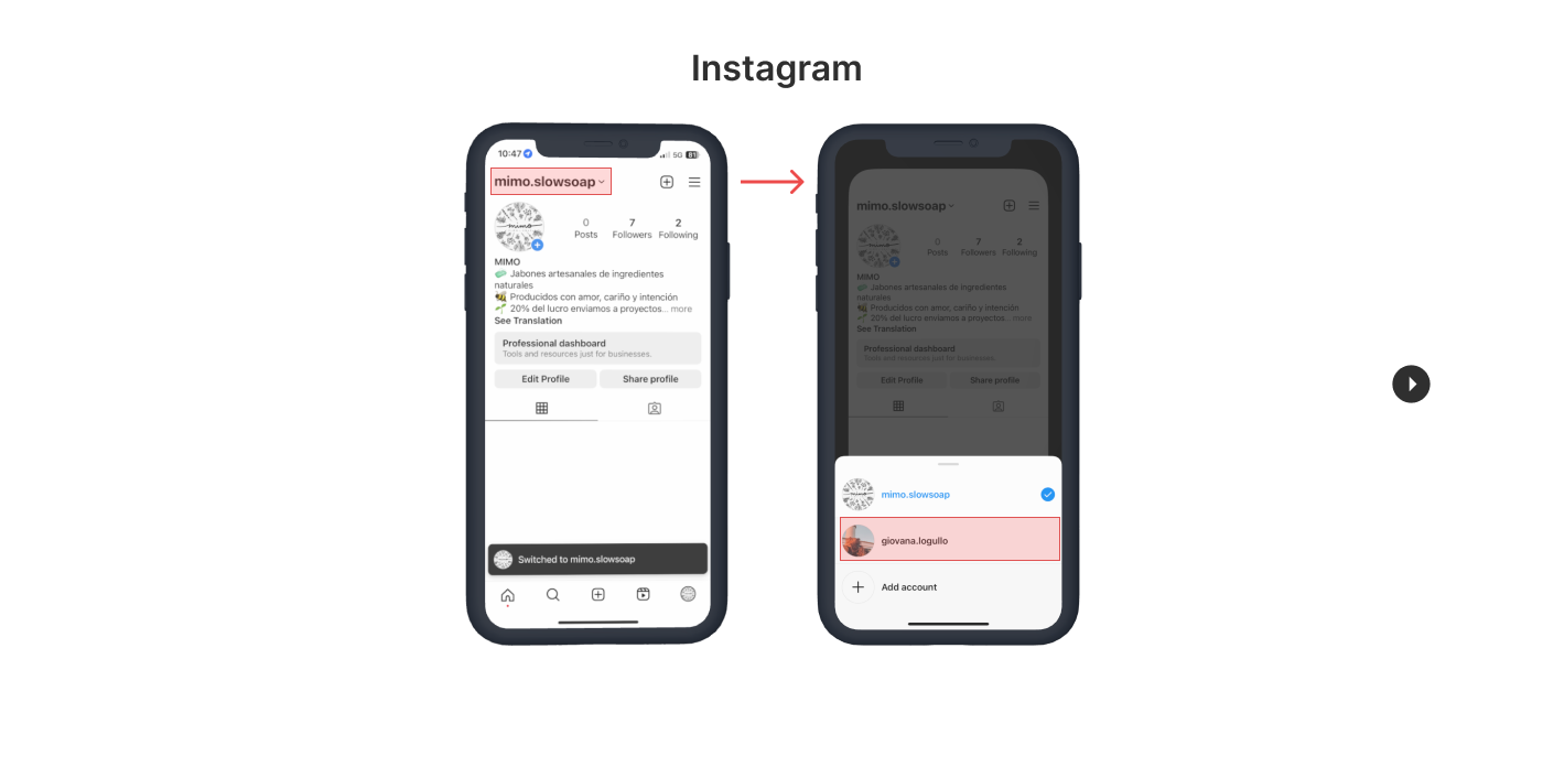
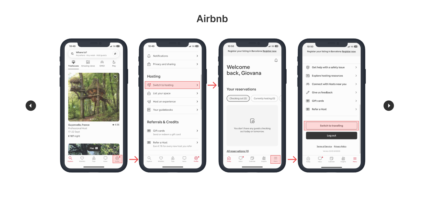
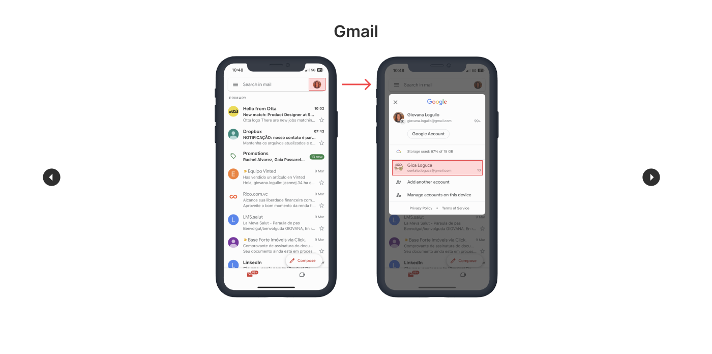
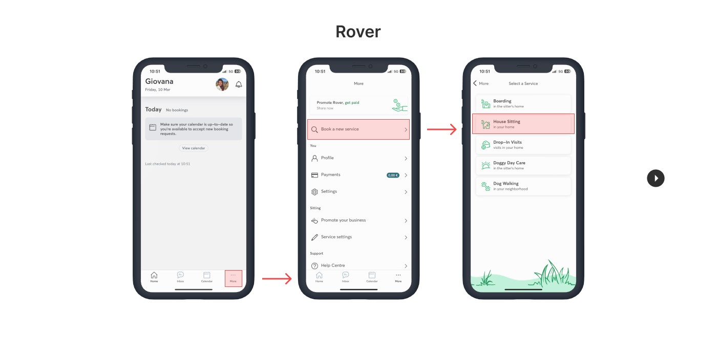
In my research on user switch functionality in various apps, including Instagram, Gmails, Airbnb, and Rover, I have gained valuable insights into both the positive and negative aspects of this feature. This analisys helped me identify aspects that I particularly appreciated, as well as elements that I found lacking or confusing.
Aspects that I liked:
– I found the profile change process in the Gmail app simple and user-friendly. Switching profiles with just one step greatly improved the user experience.
– I also liked how easy it was to access the user switch menu directly from the app’s header, similar to popular apps like Instagram and Gmail. This made navigation efficient and seamless.
– In addition, the animated transitions in the Airbnb app caught my attention. They are visually pleasing and consistent in colours.
However, I found some areas that could be improved, such as:
– In the Airbnb app, the button and its placement for switching between profiles were inconsistent. This lack of consistency in the design and location could confuse users and make it difficult for them to switch profiles smoothly.
– Additionally, in the Rover app, I noticed a unique approach where there was no requirements to change profiles in order to access the sitter profile. While this different presentation may surprise users, it is an alternative experience.
In conclusion, by understanding these strengths and weaknesses, it’s possible to enhance. the user switch functionality and create a more intuitive and seamless experience for their users.
Sketches
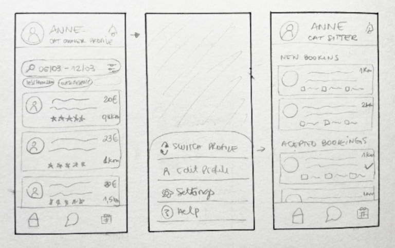
Once I had complied all this information to help guide my design, it was time to sketch. The final draft includes a modal menu that slides up from the bottom, after several attempts to find the best solution.
Ideate and Prototype
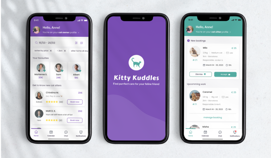
After brainstorming and sketching out all the ideas, I proceeded to create both low and high fidelity wireframes.
From there, I began the UI process, refining te prototypes in high fidelity to ensure they were as close to the final product as possible.
I tested the prototype with users to ensure that the feature was intuitive.
Play with the prototype and try to switch from one profile to another 🙂
Design Decisions
When designing an app, it is essential to ensure that it is easy for users to navigate and interact with the app. One important aspect of Kitty Kuddles app design is color consistency, which refers to the use of the same color scheme and palette throughout the app. Color consistency ensures that users can easily recognize and associate the colors with specific elements and actions. By using the same color scheme for all profiles, users can quickly identify which profile they are viewing, and this helps to enhance the overall user experience.
Another important design decision of Kitty Kuddles that is crucial for profile viewing is the use of a clear and concise button to switch between different profiles. The button should include both an icon and text, and the use of consistent colors helps to reinforce its purpose. By visually explaining to the user how to complete the task of switching between profiles, users can quickly and easily navigate through the app, further enhancing their experience.
Conclusions
In conclusion, the Kitty Kuddles app project has been an enriching experience for me. It allowed me to combine my love for cats with my app development skills. Along the way, I faced challenges that helped me grow and learn. From creating a user-friendly design to implementing interactive features, I gained valuable insights into creating an enjoyable app.
Hey there 
Thank you for reading this project, let’s collaborate?
Read my next case study below.
